
As Founding Product Designer, I built the end-to-end design system and redesigned the core ride-booking experience; shifting from a confusing schedule-first model to a ride-first flow that parents could actually use.
Timeline
January 2026- Present
Role / Context
Founding Product Designer / Early Stage Startup
Leveraged Skills
Design Systems, B2C B2B2C Design
PROBLEM & CONTEXT
27 million K-12 students in the US rely on daily rides to school, extracurriculars, and daycare. Yet the options, school buses, rideshares, private drivers, were either unsafe for children, prohibitively expensive, or simply not designed for the predictable, repeating patterns of a family's week. SchoolRyde was built to fill that gap.
Existing rideshare platforms like Uber and Lyft are built for adults; they assign random drivers, don't comply with child safety regulations, and offer zero visibility to parents. School buses are limited to school routes and don't serve the 3 PM soccer practice or the 7 AM swim meet.
SchoolRyde's model is different; a platform that connects families with licensed, professionally vetted taxi operators who are already permitted to transport minors, enabling safety and scale without bearing driver payroll or vehicle maintenance costs.
DESIGN SYSTEM
Before any screens were designed, I built a comprehensive design system from scratch. The brief was clear: a platform for parents and kids needed to feel both trustworthy and approachable — not clinical like a medical app, not casual like a game.
The palette anchors on deep navy; safety, authority, reliability, tempered by lighter blues and clean whites that keep the interface breathable. Every component was built mobile-first, with touch targets, accessible contrast ratios, and a consistent 8pt spacing grid baked in from day one.

The system covers 60+ components across six categories: navigation, forms, ride cards, payment, status, and scheduling. Each component ships with active, disabled, loading, and error states — ensuring engineers had everything they needed to ship consistently without back-and-forth design reviews.
CORE UX REDESIGN
The core problem: The original booking flow asked parents to construct a schedule, a high-cognitive-load abstraction, before they could book anything. Session data showed 71% of new parents dropped off at the schedule configuration step. We needed to rethink the mental model entirely.
Schedule First Model

What makes a schedule?
Overcrowded Screen
Too many decisions.
No Cost Transparency
How much am I paying?
Unclear Reccurence

What does it do?

FROM SCHEDULE-BASED TO RIDE-BASED
The insight was simple but fundamental: parents don't book schedules — they book rides. A schedule is just what a collection of rides looks like over time. We flipped the architecture to start with a single ride, then optionally promote it to a repeating one. This matched exactly how parents thought.
One Decision Per Step

One Page - One Decision.
Visible Ride Types

Reduced cognitive load.
Easier Repeat Rides
Control without complexity.
Preview

Summary before booking.

New Flow - One Time Ride

New Flow - Repeating Ride
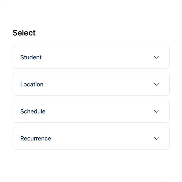
1.One decision per step. Each screen in the new flow has a single, clear job — pick a location, select a student, set the time, confirm. No cognitive overload, no parallel decision-making required.
2.Ride type is a conscious, visible choice. One Time vs. Repeating Ride is presented as a clear fork — not a hidden checkbox. Parents immediately understand the implications of each path before committing.
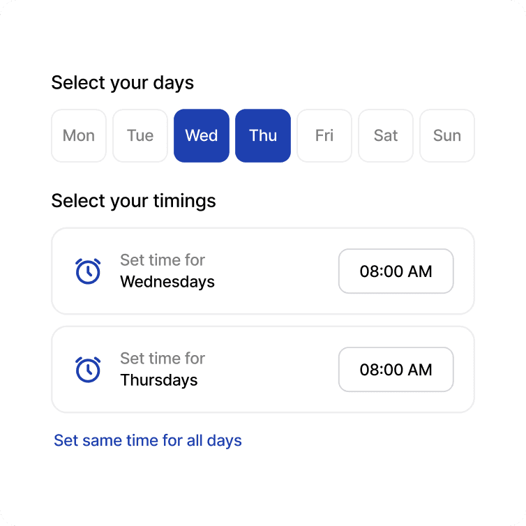
3.Repeating rides are granular and transparent. When a parent selects repeating, they can set individual times per day of the week — with a "Set same time for all days" shortcut for the common case. Control without complexity.
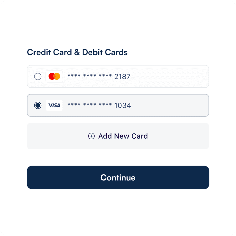
4.Full preview before commitment. The final step summarises everything — route, date/time, student, payment method, and estimated cost — giving parents full confidence before they hit Book Ride.
IMPACT
63% Drop in abandonment: Fewer parents dropped off at the scheduling step compared to the original flow.
2.4× Faster to complete: Average time to complete a booking dropped from 4m 12s to under 1m 45s.
88% Task success rate: Up from 41% in usability testing on the original flow — a more than 2x improvement.
WIP⏱️
Product is still in development. Further screens will be updated here soon.
🏆SchoolRyde was a Top 40 Finalist out of 1500 applications at GAMIC and a Top 4 Finalist out of 60 startups at PitchSF event.
If you want to know more details of this project, get in touch!
LinkedIn
Copy component
Copied